Contact us
Do you also need a clearer voice? If so, reach out to us
SCA
The challenge
Since its split from Essity in 2017, SCA’s website, channels and content had grown organically. However, many touchpoints were not aligned to the new SCA, or its vision going forward.
Messaging, tonality and visual brand experience varied across different channels, ultimately impacting trust and perception of the SCA brand. The SCA website, its components and setup had also grown over time, creating a solution that was hard to work with for editors and marketers.
This affected the team’s daily work situation and the impact of communication activities.

The solution
The first step was to co-create a shared vision of what the brand experience should be. We gathered the communication and marketing experts from the different business units and functions to define this vision together.
With these connections created, we started to decode the current setup and to understand what changes would mean for each website and unit. Breaking the project into tangible needs and results helped shape the roadmap and made it clearer. We also identified in which order we needed to take each step.
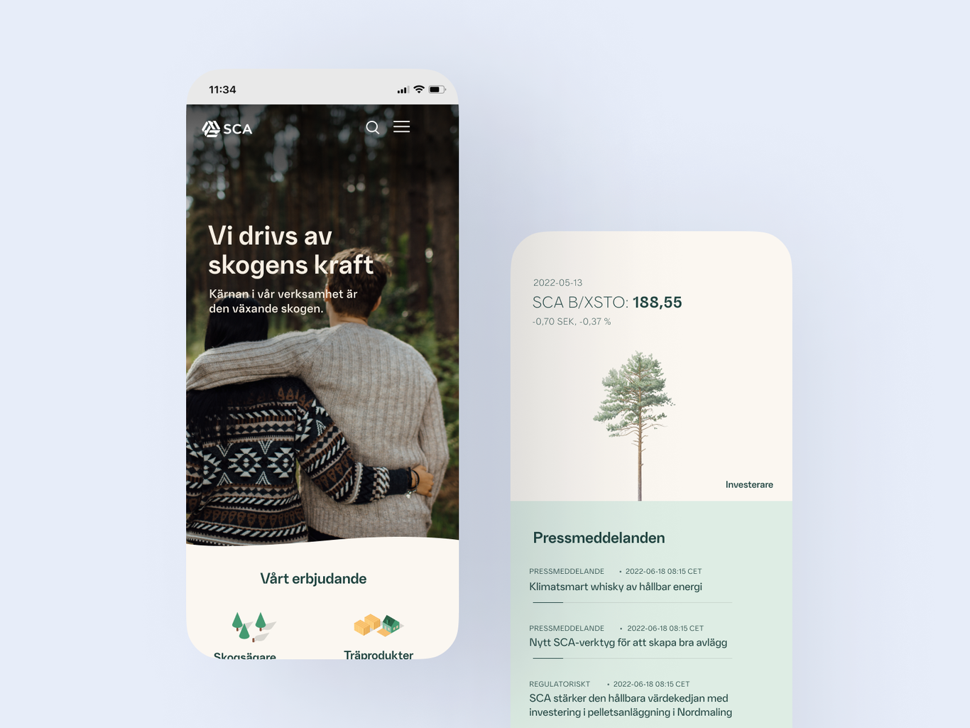
Together, we identified four focus areas to align SCA’s messaging, tonality and brand experience with the shared vision. The sca.com website was our starting project as it would provide concrete input into the other three areas - almost like a locomotive driving and pulling the vision into the rest of the business. We worked together closely to curate content and a new visual identity.
A new direction for the technology platform was created to enable the team to work better and faster. This included moving the Optimizely platform to the cloud and moving from Google Analytics to Piwik Pro and revisiting integrations and DevOps setup for increased speed and security.

SCA's communication is relevant and personal with common and unified messages in all channels.
Through transparency and commitment we run the business and build and develop our brand in digital channels together.
The impact
With a clear ambition to create a stronger and clearer voice for SCA, it was key to align and orchestrate people, content, messaging and user experience. After preparing a solid foundation, setting a shared vision and updating the visual design, we were able to move fast.
By building the website and evolving content together, with insights from analytics, audience research and the experience of the SCA team, the launch of the website marked the starting point. Now, SCA speaks with stronger digital voice. The new sca.com website represents the first step towards a more aligned and unified digital brand experience with the launch of further sites.
As we continue to measure the impact of these changes, our ongoing support and advice aim to further refine and enhance SCA's digital footprint.
A new website solution to reflect the business of today.
Learn more about Ashtead caseDo you also need a clearer voice? If so, reach out to us