Contact us
Get in touch with us to discuss how we can help with your website.
Centrica
Centrica, established in 1997, is a leading British multinational energy and services company. It operates mainly in the UK, Ireland, and North America, supplying electricity and gas to millions through brands like British Gas and Direct Energy. Centrica also offers energy solutions, home services, and innovative technologies to enhance energy efficiency.
The challenge
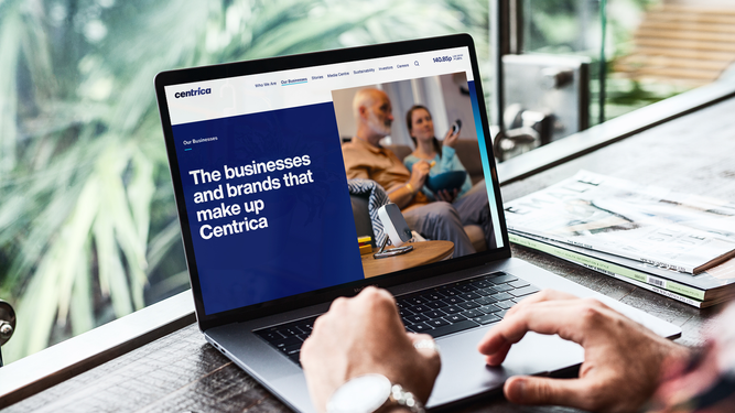
Centrica is a cutting-edge business, leading in tech and digital and driving the energy transition. This was not reflected in their old site, which had become clunky and unintuitive, through years of iterations.
It had over 100 components, affecting performance, usability and relevance.
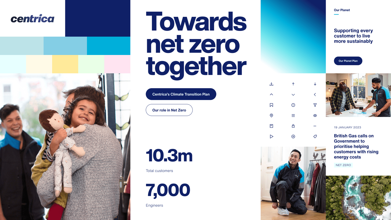
The branding was not consistently applied and the visual identity felt heavy and outdated. Old technology also meant technical risks and inefficiencies.
Coupled with a platform that was reaching end of life, Centrica’s site was no longer fit for purpose, so we were tasked with moving the site to a new, updated platform and undertaking a full website refresh. The overall aim was ‘simplification’, improving the user experience and telling a better Centrica story, to build the brand and meet increasing audience expectations.
The solution
We used the research phase to quickly pinpoint areas of improvement, including usability, findability, content and structure. We also conducted a thorough UI audit to analyse which components would be retained and removed.
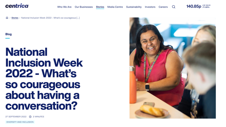
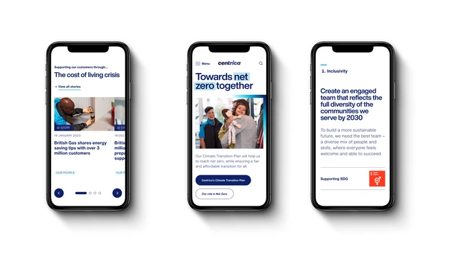
A new, intuitive sitemap was based on the most-visited pages and stakeholder requirements. We also re-organised content and hierarchy to improve readability and engagement, in particular making key data and milestones more prominent. Dynamic elements were introduced to make the website livelier and more interactive.
We developed a design approach and updated and unified the visual identity to better reflect the brand.
We also reviewed accessibility to ensure the site is accessible to all users. The platform was upgrading from Umbraco 7 to Umbraco 10 to ensure better performance and to future-proof the site.


Comprend has been a trusted partner of Centrica for nearly 10 years, so when it came to re-launching our main corporate domain, I had complete confidence in their ability to deliver. The result is a website that's cleaner, faster, more accessible, more searchable and more intuitive. I couldn't be happier with the result and my internal stakeholders feel the same way.
Michael Pullan, Head of Digital Communications at Centrica
The impact
The results speak for themselves, with level AA accessibility and accessibility scores of 94 (from 70). We have seen increased performance scores of 92 (from 87) with fewer components (100 to 30). The site has also seen improved SEO with a 30% uplift in organic search.
The updated look and feel reinforces brand consistency, and improved narrative and key messages convey important information clearly and effectively. The easy-to-use CMS has also helped internal teams, reducing the time and resources needed for ongoing website maintenance.
Accessibility score increased from 72 to 94

Organic traffic increase
Website performance score increased from 87 to 92

Rebranding Diageo with a new visual identity, enhanced storytelling and digital transformation.
Rebranding DiageoUsing data and insights to enhance digital advertising for Vepsäläinen.
Driving customer growth for VepsäläinenGet in touch with us to discuss how we can help with your website.