Contact us
Reach out to any of us to discuss how we can help you with your branding.
Premium drinks company Diageo owns some of the most recognisable brands in the world, including Guinness, Baileys and Johnnie Walker.
The challenge
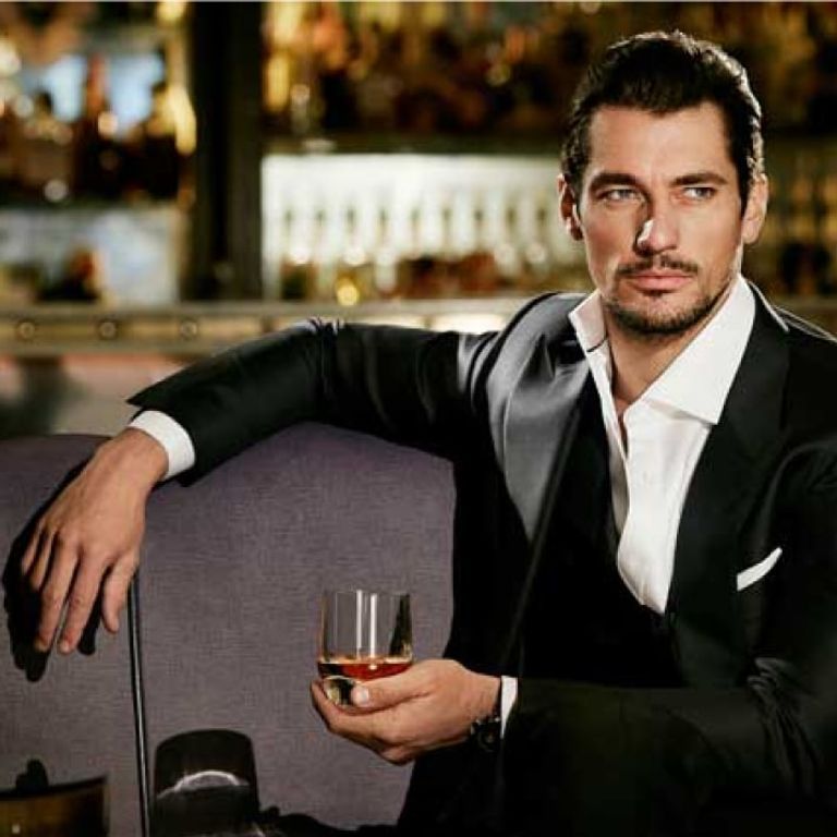
For a business that's close to its consumers with cutting-edge insights into trends, Diageo’s identity reflected darker colours and sombre imagery, which was dated by modern standards.
The existing brand was also focused on an investor audience and not accessible for other key audiences, such as job seekers.
Diageo had a compelling story to tell, but its brand was out of date and no longer reflective of the essence of the business today.

The old brand was dated by modern standards, with darker colours and sombr imagery.
The solution
We developed a brand strategy that captures the magic that goes into everything Diageo does. We refreshed the visual identity and crafted corporate messaging with a new tone of voice that was inclusive, accessible, and truly told a Diageo story.
We used research and insights alongside a dedicated brand workshop to truly get under the skin of the business.
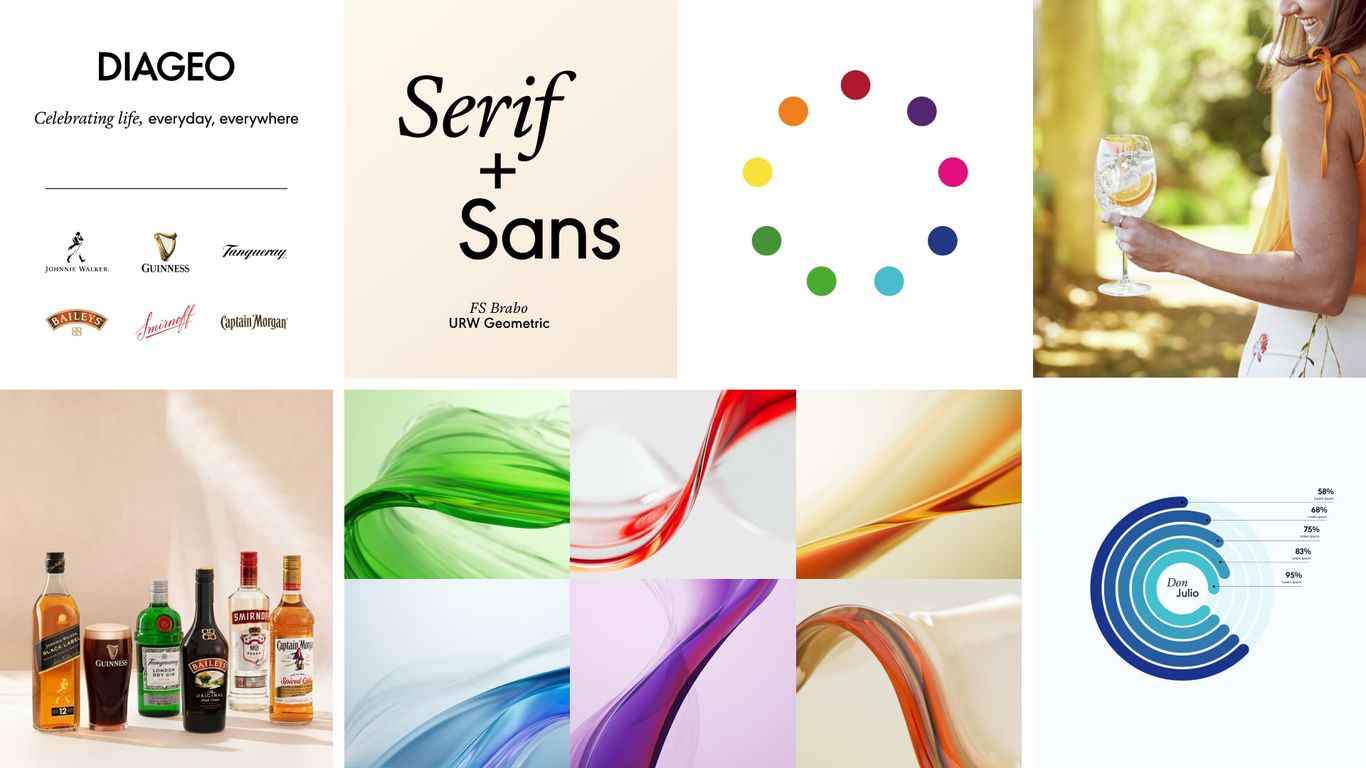
From this, we created the brand's unifying concept: Alchemy, reflecting the premium and luxury feel of Diageo’s brands, through flowing liquid and glass textures with a lighter, more colourful palette.
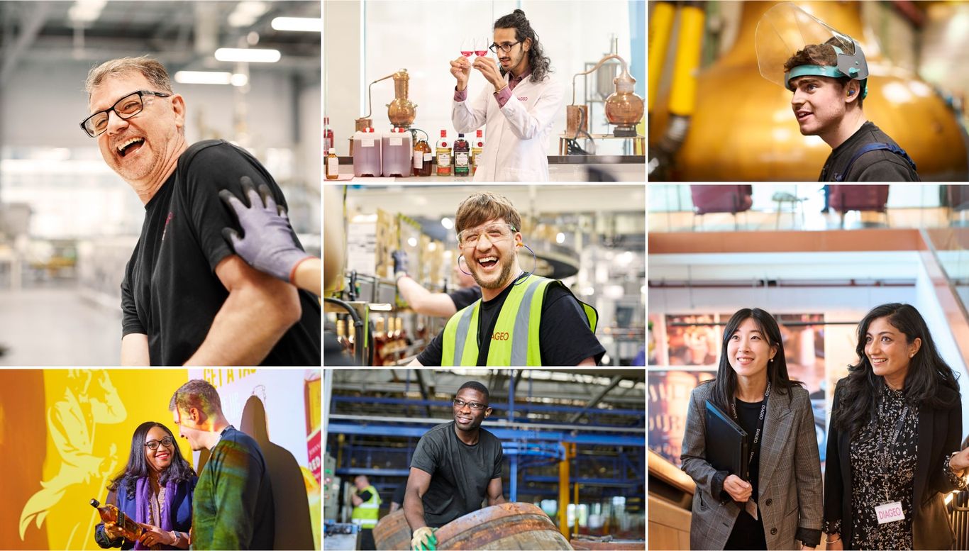
New photography celebrates Diageo’s people, brands and performance. We developed supporting materials, including a complete corporate brand book and templates for consistent, high-quality execution, globally.
Alchemy
The brand's unifying concept was 'alchemy', reflecting the premium and luxury feel of Diageo’s brands, through flowing liquid and glass textures.
Our ambition was to reposition Diageo as one of the best-performing, most trusted and respected consumer products companies in the world.
The impact
Diageo's new brand truly captures the blend of magic and science that is at the core of the business today.
The new visual identity and tone of voice are continuously applied across a variety of channels and mediums, including the website, social media, ads, brochures and presentations, building brand equity and helping Diageo to connect with stakeholders globally.
The project became the start of a longer journey, where we have continued to work with Diageo on a variety of exciting projects such as.com re-launch, employer brand positioning, market narratives, SEO, social strategy and more.
The lighter palette is drawn from Diageo’s iconic brands and rooted in the unifying concept of alchemy. New typography uses two fonts, reflecting both Diageo’s heritage and its contemporary brands.

Positive photography truly celebrates inclusivity and diversity of Diageo’s people, brands, customers and performance.

Reach out to any of us to discuss how we can help you with your branding.