Inside-out
A website is a combination of communication and a user interface (UI). A UI is a system of actions that is intended to be controlled by a human being. Reading, listening, clicking, scrolling and touching are examples of ways to interact with a UI. Seems pretty straight forward, right? So how is there room for another perspective?
Let’s start with reading and listening
It’s very common for companies to write copy that explains how they work, how good they are and how they manage their company. Because that is what they know. And that is what the truth is from their perspective.
Now put yourself in the situation where you are the user browsing for a product that could make you everyday slightly easier. Do you care? Do you care about how long the company has existed? How the tree of powerful people in the company looks? How each process works internally? Do you, being brutally honest with yourself, even care about the details in the company’s sustainability work or are you content with the ECO-label the product carries?
Recommendation:
Communicate with the user’s perspective in mind. Prioritize telling them how your product is valuable to them. Because not until they realize that your product has any value to them will they find the process of making the product interesting. They will be even less interested in knowing how the faces in the boardroom look, if they don’t find your product appealing first.
Clicking, scrolling, touching
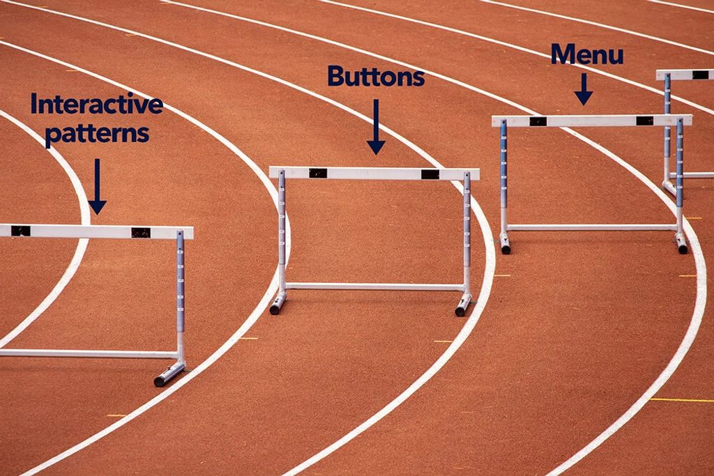
Designing a user interface is tons of fun. And lots of learning. It seems simple in the beginning,” I’ll just put a button here”, but there is so much more to it. The design of a user interface represents the brand, which of course shouldn’t be taken lightly. The UI should also be providing the user with the right tools to accomplish what you as a company set as conversion goals. It should make a technically complex task easy, and it should make the decision for the user to follow through a no-brainer. Otherwise, they will give up and go somewhere else.
We all do it. I know I do it. If the price of those jeans I’m looking for is about the same in two different webshops and one of them is that much easier to navigate and buy from, they will win me over as a customer. They share my perspective of how the process of buying jeans should be, therefor they win.
Recommendation:
Conduct studies along with tests and let research and statistics be the foundation of your UI. You think you know people, but yeah. None of us do until we do the research.

