Get in touch
Contact us today to discuss how we can help you make your website more accessible.
Remember the days before audiobooks were a thing? When ink on paper was the only way to experience the written word? It’s a world that largely excluded the visually impaired, even prompting The American Foundation for the Blind to establish a recording studio back in 1932 where books were created on vinyl records. Fast forward to the 2020s and audiobooks are the fastest growing format in publishing.
It’s one of my favorite examples of how a necessity for some inspired innovation and transformed an entire industry to the benefit of everyone. We’re seeing a similar opportunity with web accessibility standards that encourage us to create inclusive digital experiences for people with disabilities. But accessibility is for everyone, and these standards are driving fundamental shifts in how we think about inclusive design and inclusivity in general.
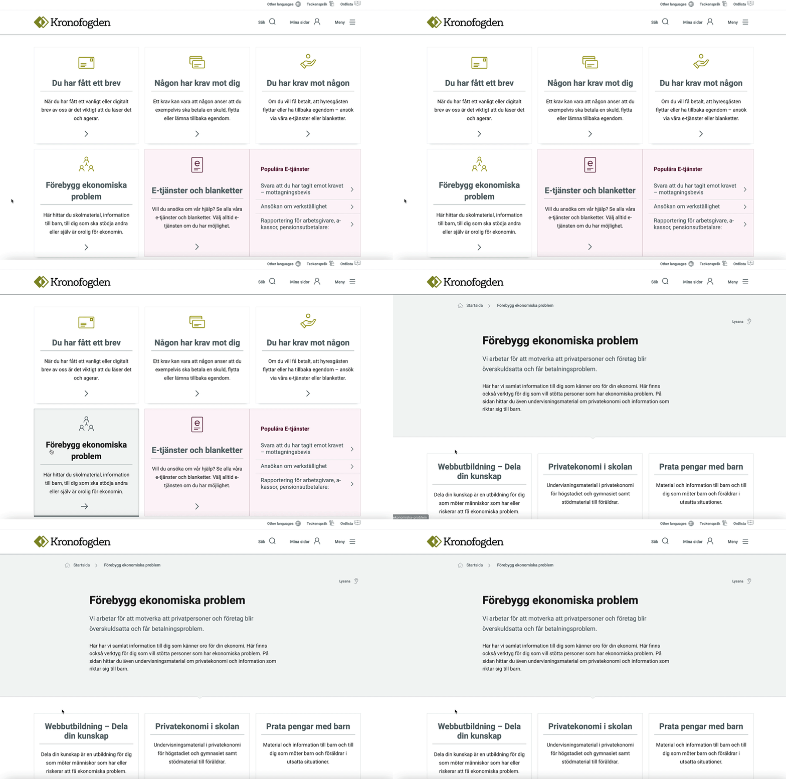
We recently worked with Kronofogden, a Swedish government agency that deals with debts. This includes helping people who have not been paid, while also providing support and advice to those who are unable to pay or are facing distraints and eviction. The journey inspired new ways of thinking and change with our top five key learnings summarized below.

Accessibility standards specify how websites can be more inclusive and accessible for people with disabilities. It’s important to remember that disabilities come in many shapes and forms from sensory (e.g. hearing or vision impairments) and emotional (e.g. anxiety or depression) to intellectual (e.g. Down syndrome or traumatic brain injury) and physical (e.g. spinal cord injuries and cerebral palsy).
Beyond legal consequences and tapping into a market with an estimated $1.9 trillion in annual disposable income, every person has a right to be included. Brands have a very real responsibility to create accessible digital experiences that are sincerely empathetic towards their customers.
A common misconception is that accessibility issues can be resolved with a few quick design changes. Not so. You also need to consider:
Content: Keep it simple by avoiding long paragraphs and specialized terminology. Think like your users and make sure that you take things like religion, ethnicity, special needs, gender and sexuality into account. Be consistent and make it easy for your user to find more information (e.g. easy access to FAQs or customer services)
Functionality: The mantra here is function before design. Also remember to think broader than accessibility to ensure an inclusive experience for all, one that is easy to use and even easier to understand.
Code: Are all the headers in the right order? Is the site usable with just a keyboard? Can a screenreader be used? Also pay attention to typography and that it scales well when people change the default font size or zoom in on content.

In fact, it can give rise to some of the most exciting innovations and game-changers. So many of the gadgets and services that we use today are the direct result of great brands wanting to be more inclusive to more people. Other than audiobooks, the majority of our favorite Google features are the direct result of an accessibility mindset.
It also doesn’t mean that you have to compromise on visuals and experience. To the contrary, so many of the accessibility changes that we implemented for Kronofogden – like a dedicated glossary that explains technical and legal terms – are useful resources for everyone and made valuable contributions to the overall user experience.
From developers and stakeholders to copywriters and the invoicing team, accessibility should be built into the very foundation of your organization. The concept is still relatively young so don’t expect this to happen overnight. Start with your developers, designers and content creators to drive the process from there.
From this perspective, Kronofogden was great to work with. They had a highly competent team who placed accessibility at the core of everything they did.
Test the design. Test the content. Test the code. Even if your results show no errors, use real people to verify the findings. For Kronofogden, we used a broad spectrum of user stories to ensure all needs and all impairments were considered. Qualitative and quantitative data gathering is also a must and will help you to quickly identify, and then fix, any accessibility stumbling blocks.
A good starting point is to identify groups of special interest. For Kronofogden, these included (amongst others) people with visual impairments, cognitive impairments, language restrictions and age-related limitations. Then go beyond the obvious to consider situational and temporary impairments. A Kronofogden example would be high stress and anxiety with a large portion of their users not being able to pay their debts. And finally, consider your remaining users who also have needs.
While all of this sounds labor intensive, don’t fret. Every accessibility step that you take will greatly improve your overall user experience. After all, well written and uncomplicated text is easy to understand for everyone. A great feature, app or gadget will be useful for everyone.
Contact us today to discuss how we can help you make your website more accessible.